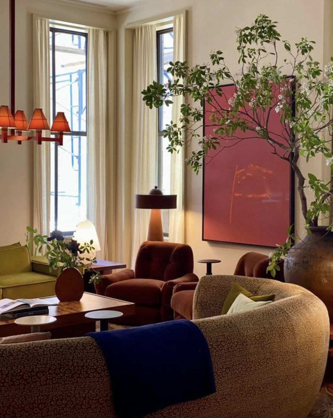
The Power of Color: Choosing the Right Palette for Your Space
Color has the transformative ability to shape a space, evoking feelings, moods, and memories. As we look to 2025, the emerging trends are all about bold revitalization, warm grounding, and timeless sophistication. Here’s how you can harness this palette of possibilities in your home.
Color Trends for 2025
2025 is bringing a mix of rejuvenation and grounding to interior spaces. Think deep, earthy tones balanced by bright accents and calming neutrals. Rich shades offer the warmth and comfort of nature, while cool hues provide a crisp contrast, adding versatility and depth.
Whether you’re transforming a cozy living room or refreshing your kitchen, these rich tones and refreshing neutrals can be adapted to fit any space’s vibe.
Paint Colors for 2025
Here are some of my favorite paint colors for 2025—I’ve done the research so you don’t have to! From deep navy and crisp blues to grounding mauves and warm browns, these colors offer endless inspiration and work beautifully in any space:
Benjamin Moore Hale Navy
Sherwin Williams Upward
Portola Paints Piano Room
Portola Paints Whitney Portal
Portola Paints Graceland
Farrow and Ball Wainscot
Portola Paints Copper Rose
Benjamin Moore Terra Mauve
Farrow and Ball Deep Reddish Brown
Bold, Contemporary Colors
If you’re looking to inject energy and personality into your space, bold hues like bright green, vibrant red, sunny yellow, and cobalt blue can transform a room. These colors add excitement and create striking focal points, giving any space a playful yet modern feel.
To achieve this contemporary aesthetic, try incorporating these brighter colors through elements that are easy to update or replace. Think table lamps, artwork, rugs, throw pillows, door trims, frames, tile, or decor. Even giving existing furniture a fresh coat of paint through a DIY project can offer a bold new look. This approach keeps your space dynamic and allows for flexibility if you decide to change the vibe later.
Layering these bold hues with softer, neutral tones or grounding them with natural textures like wood, linen, or stone can help balance the vibrancy and maintain a harmonious feel.
Monochromatic Color Schemes: A Modern Twist
Monochromatic color schemes are all about layering different shades of the same color throughout a space, creating depth and visual interest without overwhelming the senses. This approach can be applied not just through paint colors, but in furniture, artwork, drapery, and accessories. The key to pulling off a monochromatic look is in the variation of tones and textures. For example, you could layer a rich blue in your walls with soft velvet throw pillows, artwork in shades of navy, and sleek furniture in complementary hues. The result is a cohesive and serene environment that feels both modern and timeless.
A monochromatic scheme allows for a lot of creativity with textures—think wool rugs, linen curtains, and ceramic vases. These elements all work together to add visual interest, making the space feel layered and rich without the need for contrasting colors.
Layering Neutrals for Texture and Warmth
Neutral shades remain timeless, and layering them can elevate your interiors. Consider blending warm hues with cool neutrals to create understated elegance. Textural elements, such as plush rugs or textured fabrics, and soft lighting further enhance this look, making the space feel more inviting.
Conclusion
Ultimately, choosing your palette is about sparking joy and creating a space that feels uniquely yours. Whether you're embracing bold tones, layering a monochromatic scheme, or mixing in grounding neutrals, let your color choices be an expression of who you are and the atmosphere you want to create in your home.


